Poster Maker - Flyer Maker
- 4.2
- Rating
- 5.00M
- Installs
- Free
- Price
 Analysis by App-foxy
Poster Maker - Flyer Maker is the kind of Android design app I reach for when I need a presentable visual quickly rather than a full graphic-design workstation. I tested it as a practical tool for posters, banners, flyers, and social media artwork, and my overall impression is straightforward: it makes common promotional layouts approachable, but it rewards a little patience during setup and editing. If you want to turn an idea into a shareable graphic without learning professional design software, it is worth considering.
The app sits in the Art & Design category and is developed by Maxlabs Graphic Design Tools. It is free to install, rated for Everyone, and has built a sizeable audience, with over five million installs and an average rating of 4.4 from around fifty-seven thousand ratings. Those figures suggest that its main appeal is not specialist illustration, but quick, accessible composition for ordinary users.
What makes the first few minutes easy or frustrating
The first thing I noticed is that the app is most useful when I begin with a clear purpose. “Make a poster” is too broad. A better starting point is “I need a square sale graphic,” “I need a vertical event notice,” or “I need a simple birthday invitation.” That decision affects the canvas shape, the amount of text, and how much room I should leave around the edges.
You May Also Like

 Blood Strike: 2.5 Anniversary
Blood Strike’s Loadouts Turn Every Drop Into a Tactical Gamble
A close look at Blood Strike’s custom loadouts: how fast access to signature weapons reshapes its battle royale rhythm, rewards preparation, and narrows the gap between fights.

 Pandora - Music & Podcasts
Pandora’s Music Is Easy to Start, but Harder to Recover
Pandora’s strength is its low-effort path from a seed to a station. Its weak spot is how much confidence it asks you to place in connection, setup, and quiet recovery.

 8 Ball Pool
 Is Built on Rivalries, Rematches, and Routine
A close look at the rivalries, rematches, shared routines, and unanswered safety questions that turn a quick pool match into a persistent mobile community.

 Samsung Music
’s Quiet Strength Is Playing What You Already Own
Its reach comes less from spectacle than from dependable access to a personal library. That simplicity is both the app’s strongest retention engine and its ceiling.

 AccuWeather: Weather Radar
AccuWeather Review: A Quick, Clear Forecast for Everyday Decisions
For everyday plans, the best forecast is the one you can understand quickly. AccuWeather makes rain timing, radar, and local conditions easy to act on, with a few trade-offs.

 Hill Climb Racing
Why Hill Climb Racing Still Turns Crashes Into One More Run
A tiny car, a bumpy hill and one more upgrade: Hill Climb Racing keeps resurfacing because its simple chaos makes every near-miss feel personal.
More From Our News Desk



New users can get stuck by trying to perfect every element immediately. I found it more efficient to establish the background, main image area, headline, and supporting text first. Only afterward did I adjust colors, spacing, and decorative details. This order prevents a common problem: spending time polishing small elements before realizing that the main message does not fit comfortably.
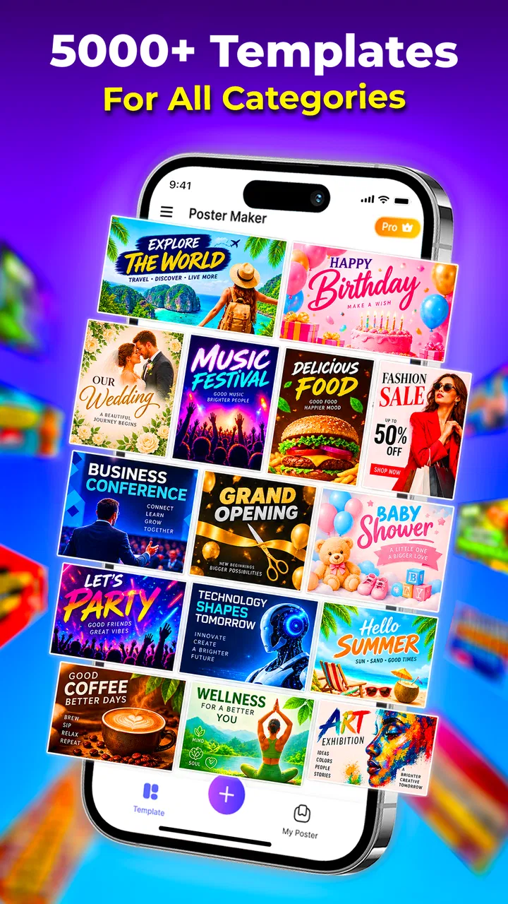
The template-driven approach is helpful for anyone who does not naturally know how to balance a layout. It gives me a visual starting point instead of a blank screen, which is especially useful for social posts and small announcements. However, a template can also make a design feel crowded if I keep every decorative element and add too much text. The best results came from treating the starting design as a framework, not as something I had to preserve exactly.
My most useful rule is to design for the person who will glance at the graphic for only a second. I keep one message dominant, use shorter supporting lines, and avoid filling every empty area. A poster often looks unfinished while I am editing it, but that breathing room is what makes the final result easier to read.
Choosing the right project before editing
For a local event, I would place the event name and date near the visual center, then keep location or contact details smaller. For a product announcement, I would give the product image more space and use the headline to explain the benefit rather than repeating the product name several times. For a social media quote, I would remove unnecessary icons and let the text become the main visual element.
This kind of planning also helps answer an important question: is the app suitable for the job? It is a good match for quick promotional artwork, informal invitations, announcements, and social graphics. It is less suitable when I need exact brand-color control, complex vector illustration, detailed photo retouching, or a carefully managed multi-page document. In those cases, a more advanced design application is the better choice, even if it takes longer to learn.
The current version is 10.4.0-9, and the app supports Android 7.0 or later. Before installing, I would check the Android version on an older phone, particularly if the device has been kept for several years. A compatible operating system does not automatically mean every project will feel equally comfortable: screen size, available storage, and general device performance can still affect editing.
Simple setup checks that prevent avoidable problems
Before starting an important design, I recommend checking three things: the phone has enough free storage, the app is running on a supported Android version, and the project has a clear destination. That last point matters because a graphic intended for a phone screen can use a different amount of text and visual detail than one meant to be printed or displayed at a distance.
I also avoid beginning a time-sensitive project with an experimental layout. I first make a small test design, add a sample image and a few lines of text, and make sure the editing controls behave as expected. This takes very little time and tells me whether the device responds smoothly enough for the work I have in mind.
When an image or design element does not appear as expected, I check the obvious causes before assuming the app is broken. The source image may not be available locally, the selected object may be behind another layer, or the element may have been moved outside the visible canvas. Tapping away from the current object and selecting it again is often more useful than repeatedly changing unrelated settings.
Text is another common source of confusion. If a line seems to disappear, I check whether its color blends into the background, whether it is too small, and whether it has been pushed beyond the canvas edge. I also shorten the wording before shrinking the font. Tiny text may technically fit, but it usually fails when somebody views the finished graphic on a smaller screen.
For a clean setup, I create a rough version first and save or export only after checking the entire composition. I look at the top, bottom, and corners, because those are the areas most likely to feel cramped. This is particularly important for banners and social graphics, where cropping or different screen displays can make edge details less noticeable.
How I recover when a design starts going wrong
My preferred recovery method is incremental rather than dramatic. If the layout becomes messy, I stop adding elements and remove the last unnecessary change. Then I restore the basic structure: background, main visual, headline, and supporting information. Starting over from a simple arrangement is usually faster than trying to rescue a crowded composition.
When an object appears to be missing, I check selection and position first. A small element can be difficult to tap if it sits underneath a larger image or decorative shape. I zoom in when possible, select the visible object that may be covering it, and move or remove that object temporarily. This is a general editing habit, but it is especially valuable in a mobile interface where several elements may overlap in a small area.
If text formatting looks inconsistent, I edit one text block at a time instead of selecting several objects together. I use one style for the main heading and a simpler style for details. This reduces accidental changes and makes it easier to identify whether the issue comes from the wording, the size, or the placement.
Another practical recovery tip is to avoid making many major changes in a single pass. I change the layout, inspect it, then adjust typography, inspect it again, and finally work on decoration. That sequence gives me a clear idea of which change created a problem. It also makes the design easier to rebuild if I need to repeat the project later.
For important work, I keep the original idea written somewhere outside the canvas: the exact headline, the required details, and the intended audience. If I start experimenting and the visual direction drifts, I can return to that short brief instead of making decisions based only on what happens to look attractive at the moment.
When the app is not the real cause of a problem
Not every disappointing result comes from the editor. A low-quality source image will still look weak after it is placed into a polished layout. I choose images that are clear at the size I expect to use, and I avoid enlarging a small image simply to fill a large area. If the picture is central to the message, it deserves more attention than minor decorative details.
Readability can also fail because of the viewing environment. A design that looks fine at full brightness on my phone may be harder to read in sunlight or on another screen. I test the finished graphic at a smaller viewing size and ask whether the headline remains obvious. If it does not, I simplify the composition before adding more contrast or decoration.
Export or sharing difficulties may involve the phone rather than the design tool. I check whether the device has enough storage, whether the destination app is available, and whether the connection is stable when sharing online. If the file appears to complete but is not visible where I expect it, I look in the phone’s usual image or download locations before repeating the export.
There is also a human cause: unclear content. No layout can fully solve a poster that tries to announce too many things at once. I decide what the viewer must remember, then remove information that does not support that goal. In my experience, reducing a paragraph to a few useful words improves the result more reliably than adding another font, sticker, or background effect.
Where it compares well with familiar alternatives
Compared with starting from a blank canvas in a professional design program, this app feels more approachable for quick work. I spend less time learning technical concepts and more time arranging the actual message. That makes it a sensible option for a small business owner, student, community organizer, or casual creator who needs a graphic without building a complete design system.
Compared with a basic photo editor, it is better suited to layouts where text and visual elements need to work together. A photo editor may be quicker for cropping or applying a simple filter, but it is not always as comfortable for building a flyer with a headline, supporting details, and a deliberate visual hierarchy.
Compared with advanced online design platforms, the trade-off is depth. Those services may offer broader collaboration, more detailed brand management, or more elaborate publishing workflows. Poster Maker - Flyer Maker is more appealing when I want to work directly from an Android phone and keep the process focused on one graphic at a time. I would choose another tool for a team project that depends on shared editing or strict brand consistency.
The free entry point is useful for trying the workflow before committing to it. The app also includes in-app purchases ranging from $4.99 to $49.99 per item, so I would check which tools or materials are available without payment before planning a large batch of designs. A free installation does not necessarily mean every creative option is included, and that distinction matters if I need a specific style repeatedly.
Who will get the most from this app
I think it is strongest for people who need speed, a friendly learning curve, and a finished-looking result without formal design training. A café owner could prepare a weekend announcement, a tutor could make a class reminder, or a family member could create a simple celebration invitation from a phone. These are realistic jobs where clarity matters more than technical perfection.
It is also useful for someone who has ideas but struggles with composition. Beginning with an existing visual structure can teach practical design habits: where to place the headline, how much space to leave around an image, and why a limited number of type styles usually looks calmer. I would use it as both a production tool and a way to build confidence.
I would skip it if my main goal were detailed illustration, professional print preparation, advanced photo manipulation, or a large library of carefully controlled brand assets. I would also look elsewhere if I needed a desktop-first workflow or frequent collaboration with other designers. The app’s convenience is its main strength, but convenience should not be confused with the complete feature set of specialist software.
My everyday workflow for a dependable result
For a typical announcement, I start by writing the message in plain text before opening the editor. Then I choose a layout that matches the intended viewing format, place the main image or visual focus, and add the headline. I keep the supporting information short and check that it can be read without zooming.
Next, I remove anything that competes with the main message. This is where many quick designs improve most. I prefer one strong decorative decision over several weak ones, and I leave a margin around important text. After that, I inspect the graphic at a reduced size, because this reveals whether the hierarchy works beyond the editing screen.
Before sharing, I read every word slowly, check dates and contact details, and look for accidental overlaps. I also view the result against the likely background of the destination, especially if it will be posted among many other images. A technically attractive design can still be ineffective if its headline does not stand out in a busy feed.
If I need several related graphics, I keep the same visual approach across them rather than redesigning each one from scratch. Consistent placement and wording make a small campaign feel more organized. At the same time, I would not duplicate a layout blindly: a square social image, a tall phone graphic, and a wide banner each need their own spacing decisions.
My practical verdict
After using it as a mobile poster and flyer tool, I see Poster Maker - Flyer Maker as a capable choice for fast, personal, and small-scale visual communication. It lowers the barrier to making something more considered than plain text, while still leaving enough room for users to make poor choices if they overcrowd the canvas or ignore readability.
The app is free to start, available for Everyone, and backed by a large Android user base. Its developer, Maxlabs Graphic Design Tools, has positioned it for accessible design rather than specialist production, and that focus is clear in the way I would use it: choose a suitable starting point, adapt the message, check the layout, and share the result.
I recommend it when your priority is producing a clear graphic from an Android phone without a steep learning curve. I would not make it my first choice for demanding professional work, collaborative design, or highly controlled print projects. For everyday announcements, event artwork, simple promotional material, and social media visuals, though, it offers a practical balance between speed and creative control.
The best results come from treating the app as a focused layout assistant rather than a magic design button. Prepare the message, keep the hierarchy simple, test the composition at a small size, and troubleshoot the phone or source material before blaming the editor. With that approach, it becomes a useful companion for turning a rough idea into a graphic that people can actually understand.
FAQs for Poster Maker - Flyer Maker
01What can I create with Poster Maker - Flyer Maker?
Poster Maker - Flyer Maker allows you to create a variety of visual content, including posters, flyers, banners, and social media graphics. The app offers a wide range of templates, fonts, and design tools to help you craft professional-looking designs easily. It's suitable for both personal and business use, making it versatile for different needs.
02Is Poster Maker - Flyer Maker user-friendly for beginners?
Yes, Poster Maker - Flyer Maker is designed with an intuitive interface that caters to users of all skill levels. Beginners will find the drag-and-drop functionality and customizable templates particularly helpful. The app provides tutorials and tips to guide new users through the design process, ensuring you can create stunning visuals with ease.
03What features are included in Poster Maker - Flyer Maker?
The app includes a wide array of features such as customizable templates, a vast library of fonts and graphics, and advanced editing tools like resizing, layering, and color adjustments. It also supports importing your own images and offers options for high-resolution exports, making it a comprehensive tool for all your design needs.
04Does Poster Maker - Flyer Maker offer any in-app purchases?
While Poster Maker - Flyer Maker is free to download, it offers in-app purchases for additional features and content. These may include premium templates, exclusive design elements, and advanced editing tools. Users can choose to purchase these individually or opt for a subscription model for full access.
05Can I share my creations directly from the app?
Yes, Poster Maker - Flyer Maker allows you to share your designs directly from the app to various social media platforms, email, or print services. The app ensures that your creations are exported in high quality, making it easy to distribute your work for personal, promotional, or business purposes.
Pros
- User-friendly interface for quick designs.
- Wide variety of templates available.
- Customizable fonts and colors.
- High-quality export options.
- Supports multiple social media formats.
Cons
- Limited free features
- requires in-app purchases.
- Occasional ads can interrupt workflow.
- Lacks advanced editing tools.
- Some templates feel repetitive.
- App size can be heavy for older devices.

Poster Maker - Flyer Maker
Gallery